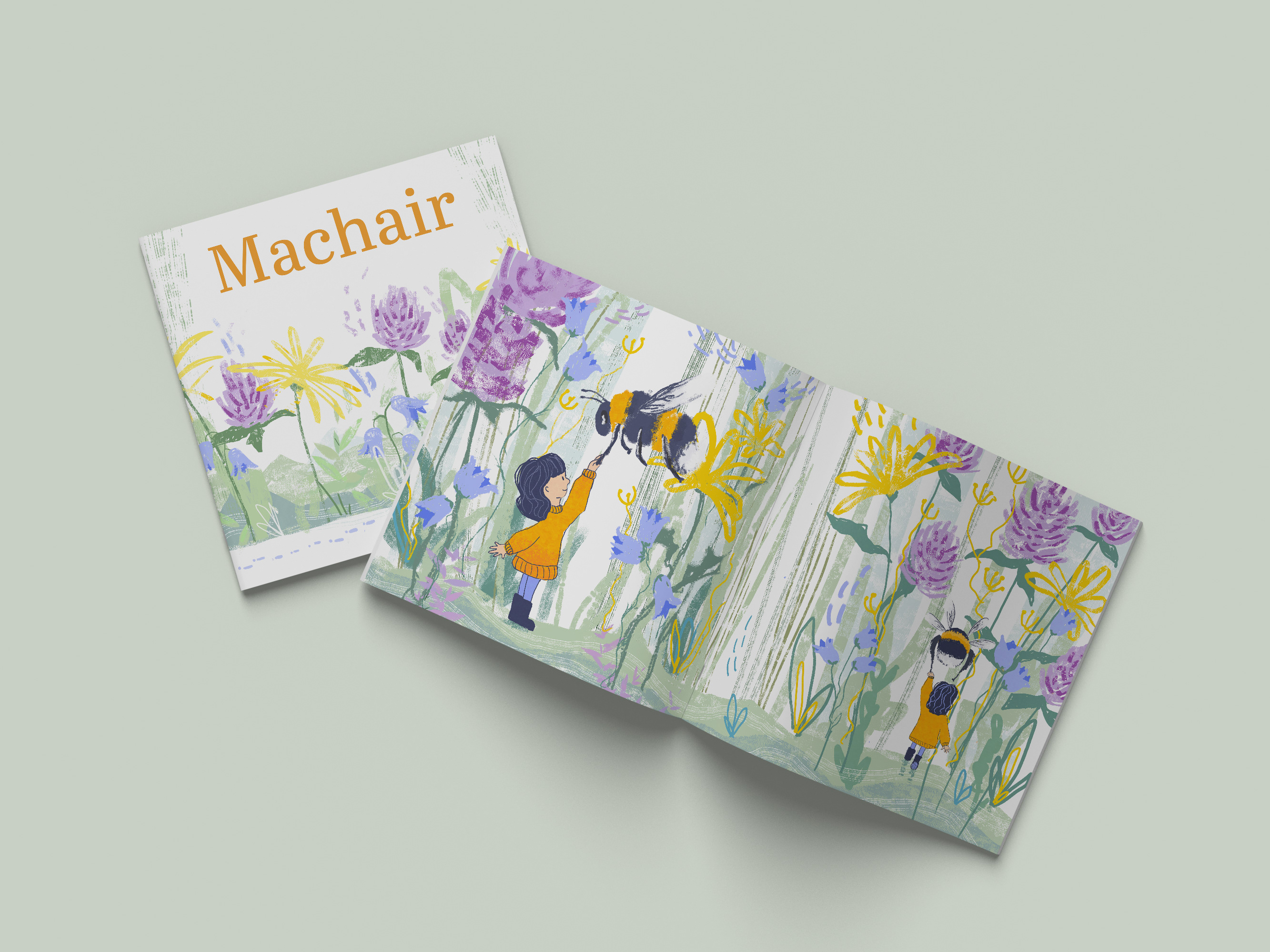
Brand-Aligned Brochure Design – Counselling Highland
8-Page Print Brochure | Visual Identity & Art Direction
8-Page Print Brochure | Visual Identity & Art Direction
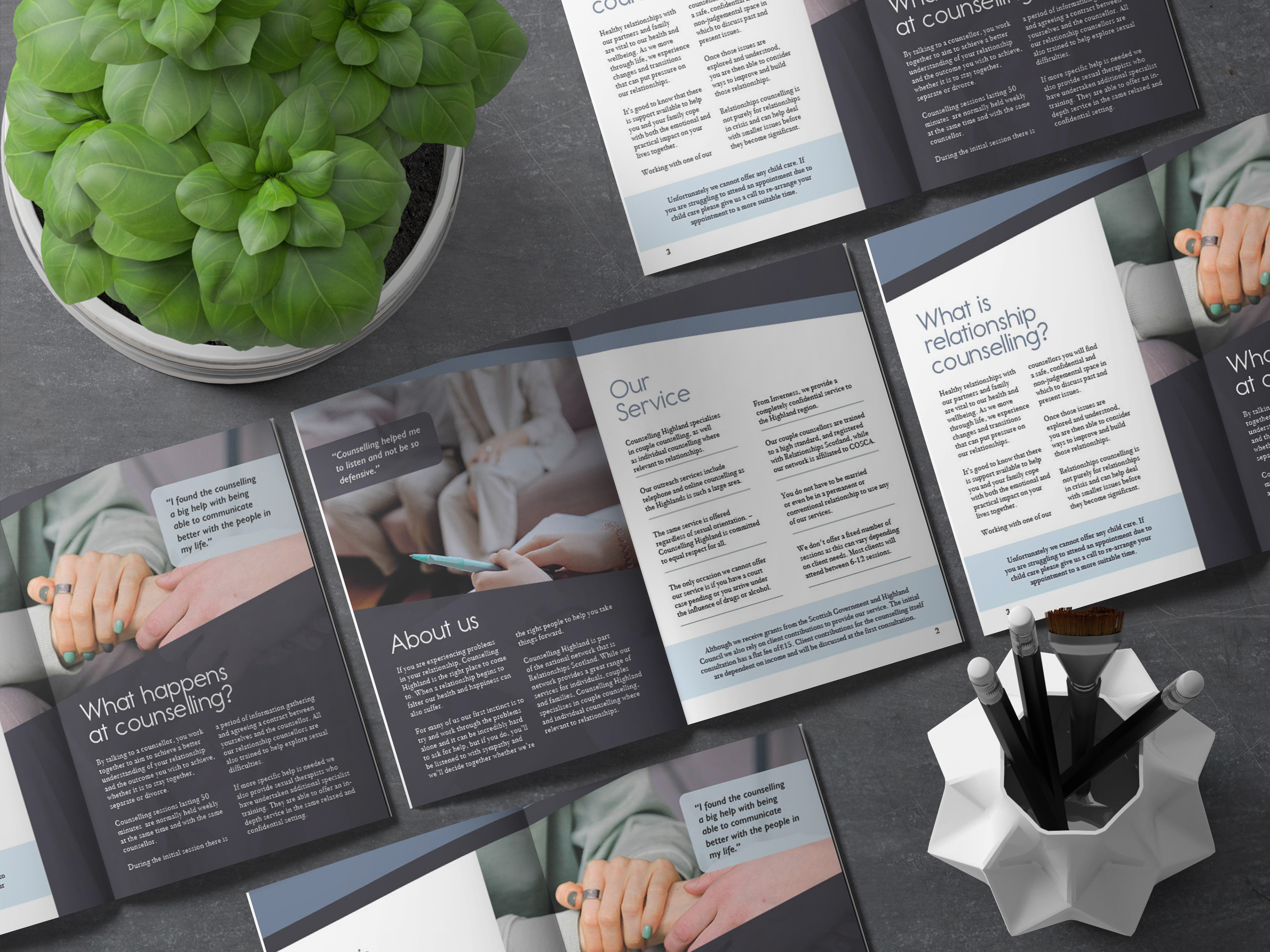
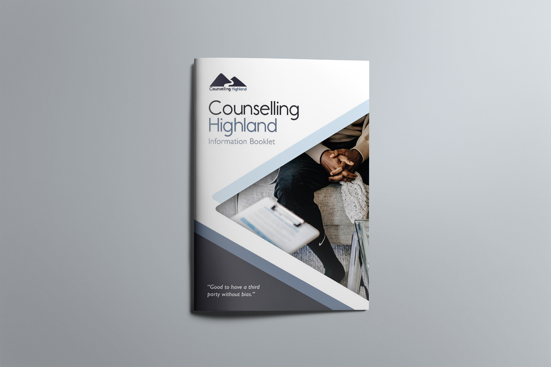
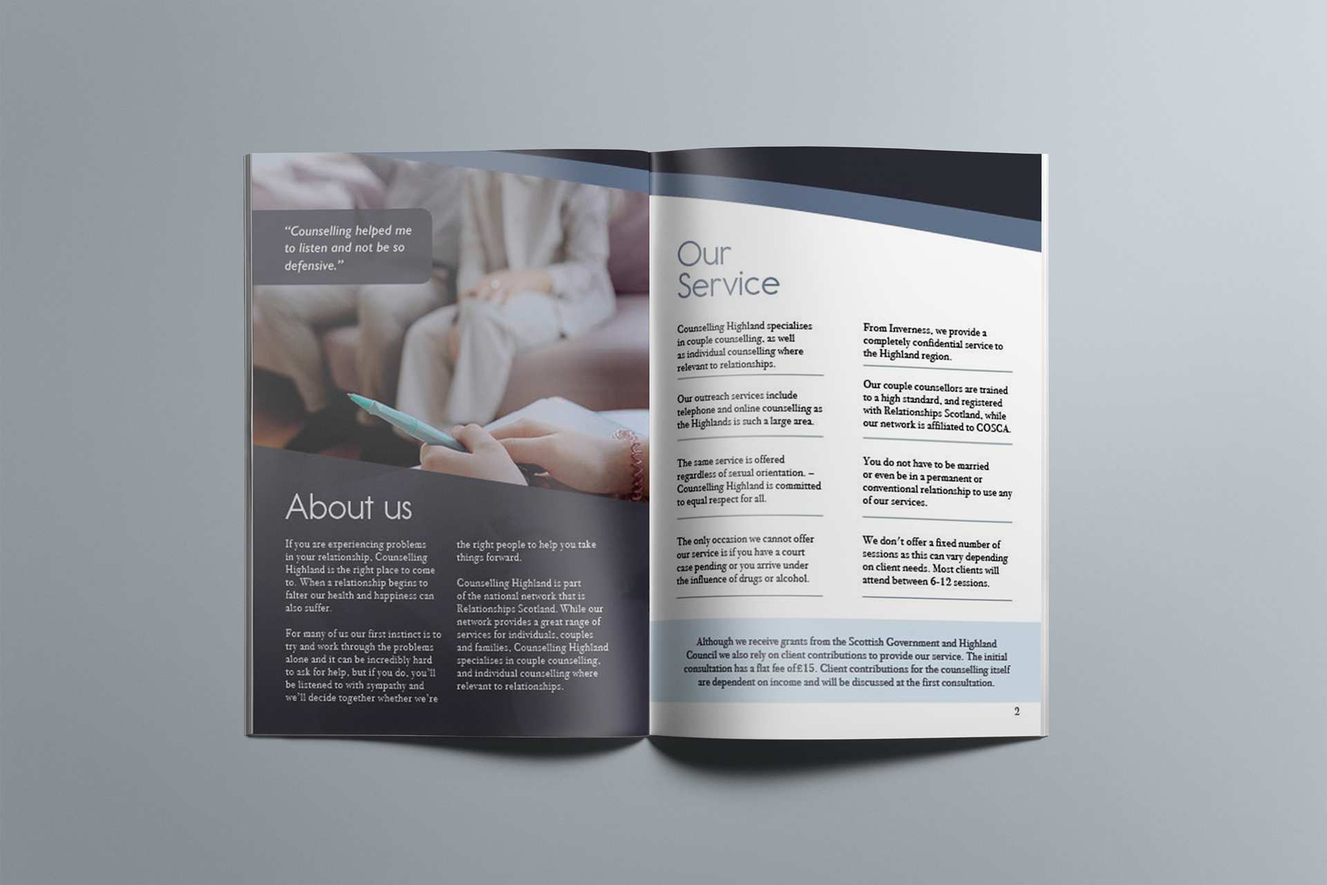
This project was created for Counselling Highland, a charity offering accessible, confidential mental health support across the region. The brief was to design an 8-page brochure that aligned with their newly launched logo and helped to establish a consistent, recognisable visual identity as they expanded their outreach.
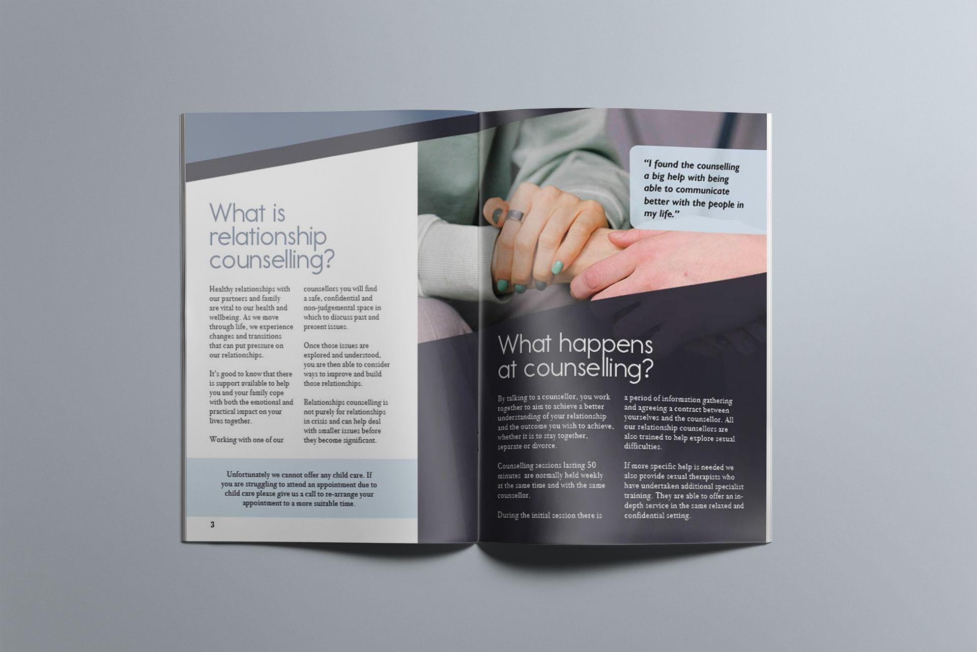
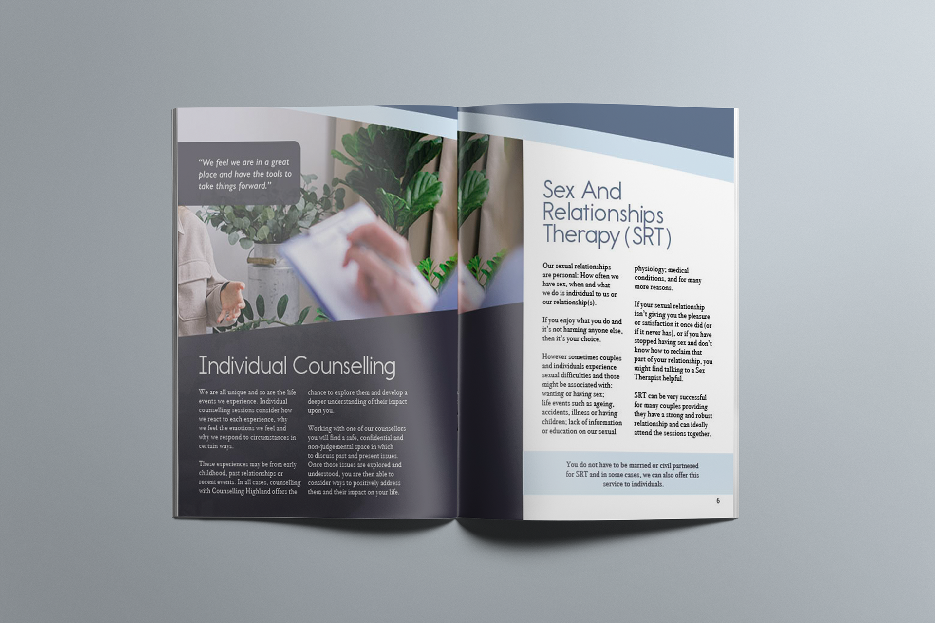
Although I was not involved in designing the logo itself, I developed the branding and art direction of the brochure around it. The logo features a pair of stylised mountains, symbolising stability and guidance—qualities that are core to the charity’s mission. To reflect and reinforce this visual language, I incorporated angled shapes and graphic elements inspired by the peaks throughout the layout. These design cues help create a cohesive, visually distinctive brand presence that sets Counselling Highland apart from NHS materials, which can often feel more clinical or impersonal.
In terms of imagery, I made the deliberate choice to use photographs of hands rather than faces. This decision was both practical and emotional: suitable facial imagery was limited, and those available often conveyed emotions that were either too sombre or overly cheerful—neither of which felt appropriate for the brochure’s tone. Hands, on the other hand, offer a more subtle and symbolic representation of connection, care, and support, aligning with the charity's aim to build trust and communicate intimacy without overwhelming the viewer.
Overall, the brochure serves as both an informative resource and a brand-defining piece that helps Counselling Highland communicate its values clearly and compassionately to new and existing clients.
Thank you for viewing